SnapGPT usage
The SnapGPT usage page (Monitor > SnapGPT usage) highlights how users in your environment are adopting and engaging with SnapGPT. You can:
- Monitor active user counts for daily, weekly, and monthly periods.
- Review prompt volume and per-user engagement trends.
- View the most and least used SnapGPT skills.
- Identify your most active users by prompt count.
Page controls
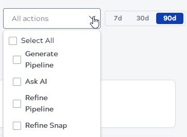
The controls at the top of the page apply to the active users trend chart and the prompts chart.
- Time range selector: Select between 7, 30, and 90 days to change
the period shown in the trend charts and the Prompts tile.Note: The active user tiles always reflect fixed trailing periods (yesterday, last 7 days, and last 30 days) regardless of the selected time range.
- All skills filter: Multi-select the options from the dropdown to filter the charts based on one or more SnapGPT skills. The default value is all skills.
Adoption and activity
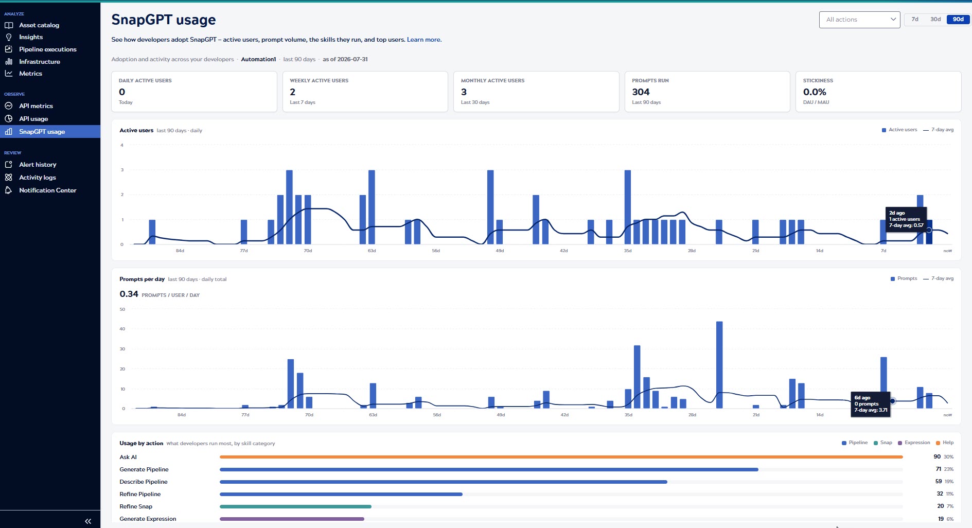
The top row of tiles and the two trend charts provide a snapshot of how widely and how often SnapGPT is used.
Active users and prompts
The top of the page displays the following tiles:
- ACTIVE USERS (YESTERDAY): The number of unique users who ran at least one SnapGPT prompt yesterday. For example, a value of 5 means 5 different users used SnapGPT yesterday.
- ACTIVE USERS (LAST 7 DAYS): The number of unique users who ran at least one prompt in the last 7 days. A value of 20 means 20 different users have engaged with SnapGPT at least once this week, regardless of how many prompts each ran.
- ACTIVE USERS (LAST 30 DAYS): The number of unique users who ran at least one prompt in the last 30 days. Use this to gauge the overall reach of SnapGPT adoption across your environment.
- STICKINESS (LAST 30 DAYS): The ratio of daily active users to monthly active users, expressed as a percentage. A value of 30% means that, on average, 30% of your monthly users return to SnapGPT on any given day. Higher values indicate that SnapGPT is part of users' daily workflow rather than used occasionally.
- PROMPTS: The total number of prompts submitted in the selected time range. A high number relative to your active user count indicates that users are running multiple prompts per session and engaging with SnapGPT regularly.
If no SnapGPT activity exists in the selected range, all tiles display 0 or 0% and a guidance message appears in place of the charts.

Active users chart
The chart displays two overlapping data series over the selected time range:
- Bars: Each bar represents the number of unique active users on a specific day. Taller bars on certain days indicate higher-than-usual engagement. For example, a spike mid-week might suggest a team training session or a new feature release driving adoption.
- Trend line: The 7-day moving average line smooths out day-to-day variation so you can view whether overall adoption is growing, declining, or staying flat over time.

Hover over any bar or point on the trend line to see a tooltip showing when the data point occurred, the number of active users on that day, and the 7-day average at that point. For example, a tooltip showing Aug 26 · 2 active users · 7-day avg: 0.57 means that on August 26, 2 users were active, and the average over the surrounding 7 days was 0.57 users per day.
Prompts chart
The chart displays the total number of prompts submitted across all users each day over the selected range, with two overlapping data series:
- Bars: Each bar represents the total prompts run on that day across your environment. A consistently high bar height indicates regular, sustained usage. A sudden spike may point to a specific event such as a demo, training, or a new feature being explored.
- Trend line: The 7-day moving average smooths daily fluctuations so you can identify whether overall prompt volume is trending up or down over time.
The Prompts / user / day headline above the chart displays the average number of prompts per active user per day across the selected range. A higher value indicates that active users are engaging deeply with SnapGPT, not just trying it once.
Hover over any bar or point on the trend line to see a tooltip showing when the data point occurred, the total number of prompts on that day, and the 7-day average at that point. For example, a tooltip showing Jul 22 · 17 prompts · 7-day avg: 2.57 means that on July 22, 17 prompts were run in total, and the average over the surrounding 7 days was 2.57 prompts per day.

Prompts by skill
The Prompts/Users by skill section displays the SnapGPT skills that are widely used. The pie chart provides a proportional view of prompt or user distribution across all skills, and the list on the right displays the exact count and percentage of prompts or users for each skill.
Click the following tabs to view the number of users or prompts based on the product area:
- All: From both Designer and Monitor.
- Designer: From Designer only.
- Monitor: From Monitor only.
Use the Prompts and Users tabs to switch between viewing prompt counts and unique user counts.
Each row in the list displays the skill name, the total count, and that skill's share of all prompts or users in the selected time range. For example, Describe pipeline · 4 · 44% means that 4 prompts or unique users used the Describe pipeline skill, which accounts for 44% of all prompts or users. Skills with no prompts or users for the selected time range appear at the bottom of the list with a count of 0.
Use this section to identify which skills are well adopted and which remain underused, and to understand whether usage is concentrated in Designer or Monitor workflows.

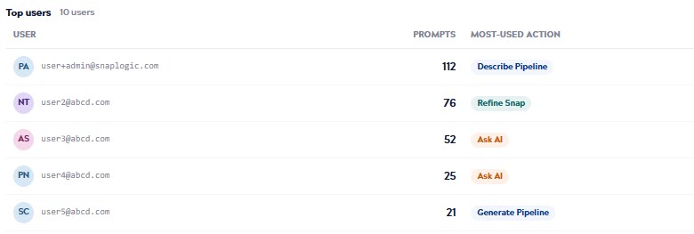
Top users
The Top users table identifies the most active SnapGPT users in your environment for the selected time range, ranked by the number of prompts they have run and the skill they have used the most. Use this table to find the SnapGPT champions, the users who engage actively with SnapGPT.
The table displays the following columns:
- USER: The email address of the user.
- PROMPTS: The total number of prompts the user submitted during the selected time range. A higher number means the user is engaging with SnapGPT more frequently. For example, a value of 45 means that user ran 45 SnapGPT prompts during the selected time range.
- MOST-USED SKILL: The SnapGPT skill that user ran most often during the selected time range. For example, if a user's most-used skill is Generate pipeline, it means they primarily use SnapGPT to build pipelines.