


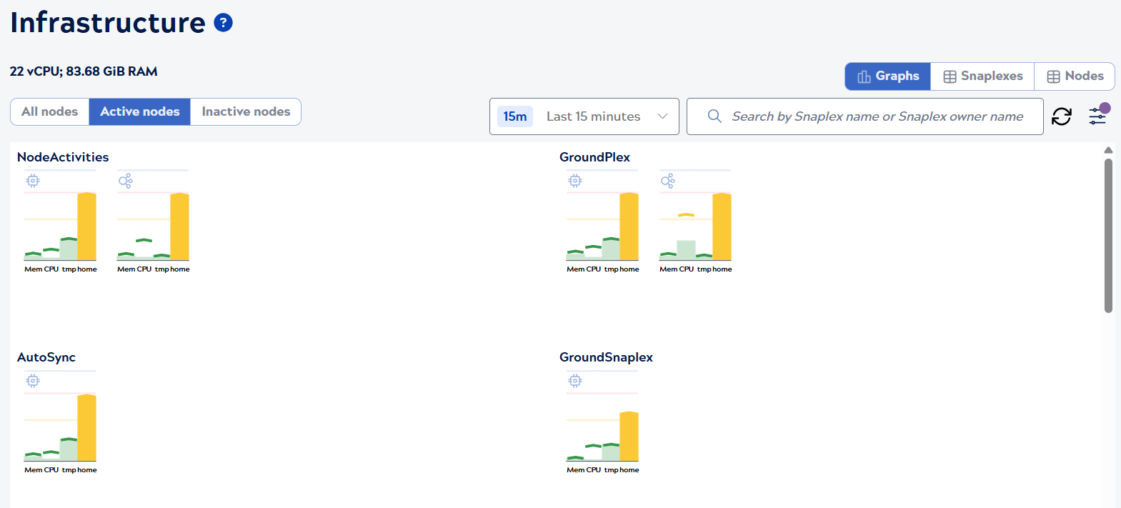
Infrastructure Graphs view
The Infrastructure Graphs view displays usage graphs for Snaplexes and nodes. The graphs track average and maximum memory, CPU, and disk usage for the tmp and home directories. Snaplexes with nodes using more than 45% of the available resources move to the top of the page.
Content selector
Use the content selector on the left side to filter which nodes are displayed in the graphs:
- All nodes: Shows all nodes
- Active nodes: Shows only active nodes
- Inactive nodes: Shows only inactive nodes
The control plane marks nodes inactive after 15 minutes without receiving a heartbeat from them. Nodes in maintenance mode are also inactive. They have a Snaplex service running on them, but don't process requests. Nodes active for less than 15 minutes that stop unexpectedly don't display as inactive nodes. Nodes in maintenance mode show in the Infrastructure Inactive nodes filter, and have no associated data. Offline Snaplexes (those with no nodes) only show with the All nodes filter selected.
View selector
Use the view selector on the right side of the page to switch between Infrastructure views:
- Graphs: Visual display of resource usage (current view)
- Snaplexes: Table view of Snaplex-level information
- Nodes: Table view of individual node details
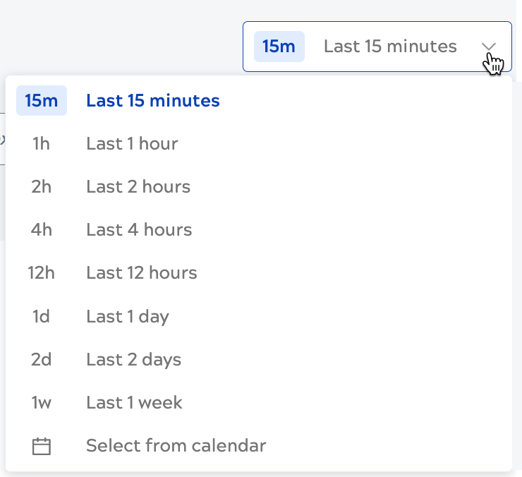
Page controls
Use the page controls to:
- Change the time period, up to the last 45 days:
- Search Snaplexes by Snaplex name or owner or click the configuration control to use advanced
filters:

- Refresh the graphs
Interpret graphs
In the graphs:
- Bars represent the average for memory, CPU utilization, and disk utilization for the selected time period. The average is calculated from all raw metric data points collected during that period.
- The carets mark the maximum values during the selected time period, calculated from all raw metric data points.
- Bars and carets are color-coded: Green indicates values up to 45%, yellow indicates up to 75%, red indicates over 75%.
- Icons indicate JCC and FeedMaster nodes.
- Nodes with average or max values in the yellow or red range show at the top of the page.
For more details:
- Hover over a node to view the actual values:
Linux node Non-linux/Windows node 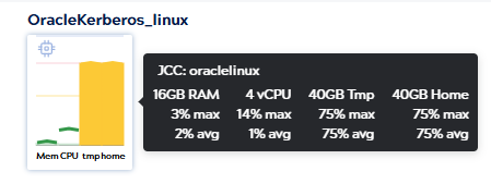
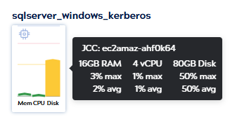
Note: For Linux nodes, disk space is reported in separate values for tmp and home. For non-Linux nodes, tmp and home display the same disk space values. - Click a Snaplex graph to view its details panel.
- Click a node bar to view its details panel.
Learn about the Snaplexes view, Nodes view, and how to analyze and manage Snaplexes.