


Data preview from pipeline
- Preview Data Output: View sample data from successful Snaps or error documents from failed ones.
- Encryption: SnapLogic encrypts all sample data before storing it.
- Defaults: By default, the preview includes up to 50 records or 15 MB. Exceeding this limit causes validation errors.
Org admins can adjust the preview record limit or disable pipeline validation in Admin Manager. Users can modify the record limit in their Project's User Settings (up to the admin-defined maximum).
Data Preview appears as a table by default. Choose JSON or raw format for unstructured views. Use DataViz to create visualizations like pie charts, bar charts, or scatter plots.
- Pie chart - Organizes data in sectors, where each sector represents a group proportionate to the whole.
- Line chart - Compares trends visually for multiple fields or a single field over time.
- Bar chart - Compares a category from a data set, similar to a pie chart. The simple bar chart displays the number of instances for a field. The group and count bar chart compares data sets from two categories against an index, such as time or geographical location.
- Scatter chart - Plots the data set for two fields as a map of coordinates and optionally aggregates the data by a third category.
Launch data preview
You can launch the Data Preview window from the pipeline SnapLogic Designer.
Prerequisite: You must have execute permissions to the pipeline
Project/Project Space.
- In Designer, click
 to validate the pipeline.
 - After the validation is complete, click the
 in the connector on the right side of the
Snap:
in the connector on the right side of the
Snap:
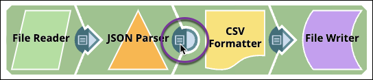
Depending on your OS, the Data Preview window is launched in one of the following ways:
- On Windows, click the data preview icon.
- On MacOS, double-click the data preview icon.
- Navigate the data preview of a validated pipeline.
Default view
By default, the data preview displays as a table. The Data Preview for some Snaps, such as file readers, displays the metadata instead of data values. The following example shows preview data values after passing through an Excel Parser Snap:
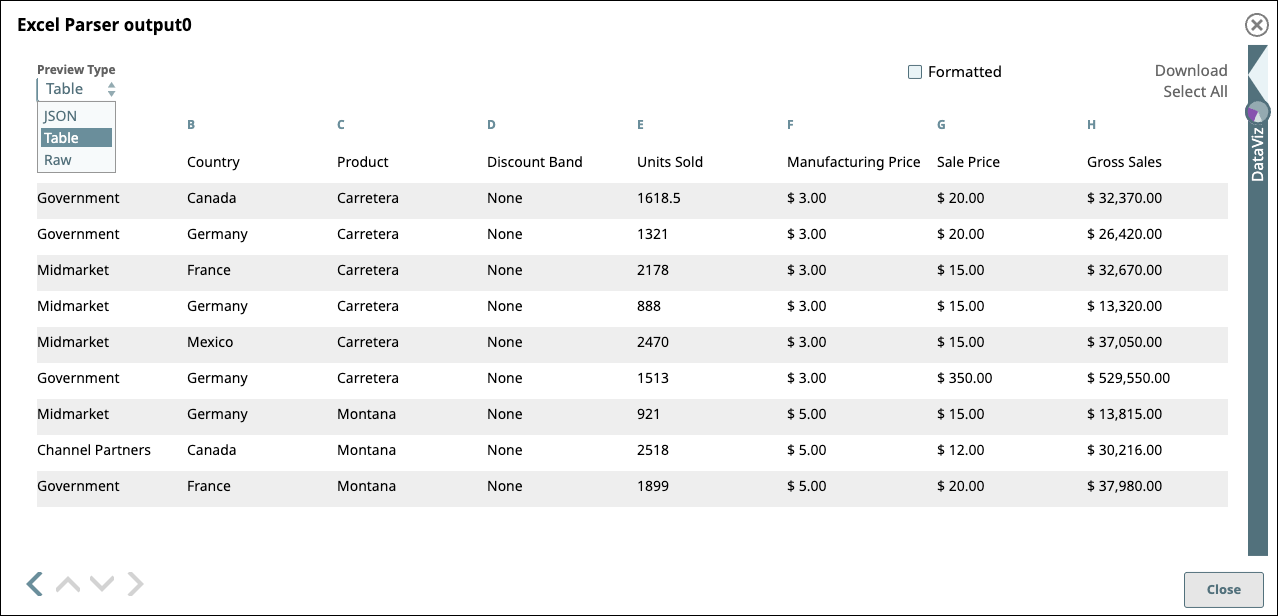
Data Preview displays by default in a standard table with infinite scrolling capabilities.
Summary of controls
Use the controls in the Data Preview pane to:
- Switch the data format to JSON or raw
- Display preview document data formatted with line feeds
- Navigate through the preview data
- Open DataViz to generate a chart from the preview data
- Move to the Preview Data for the next or previous Snap
For a description of all controls, refer to Data Preview Controls.
Limitations
In preview data, number fields do not always display the expected values:
- JavaScript has limitations in displaying numbers. The actual value is maintained in the data; however, the preview might not display the numbers accurately. For example:
- Numbers greater than the JavaScript constant
Number.MAX_VALUEdisplay asInfinity. Learn more about MAX_VALUE. - Integers greater than the JavaScript constant
Number.MAX_SAFE_INTEGERmight be rounded or otherwise displayed incorrectly. Learn more about MAX_SAFE_INTEGER.
- Numbers greater than the JavaScript constant
- Numbers without significant fractional values are displayed as integers. For example:
10.00is displayed as10. - If you do not have execute permissions to the pipeline, then launching the Data Preview instead causes the UI to display a blank screen without an error message.