


Card sections
Use cards to showcase helpful information for DeveloperHub visitors. By default, a card section has three cards, you can add more or delete them.
A card section has two elements: a title and text by-line. Each card has four elements: an image, title, text, and link. Sections describes how to add, move, or delete a card section. This page describes how to edit a card section and the cards it contains.
After adding a card section to a page, hover over the section to reveal the Edit Content button. The card editor divides the options into three tabs:
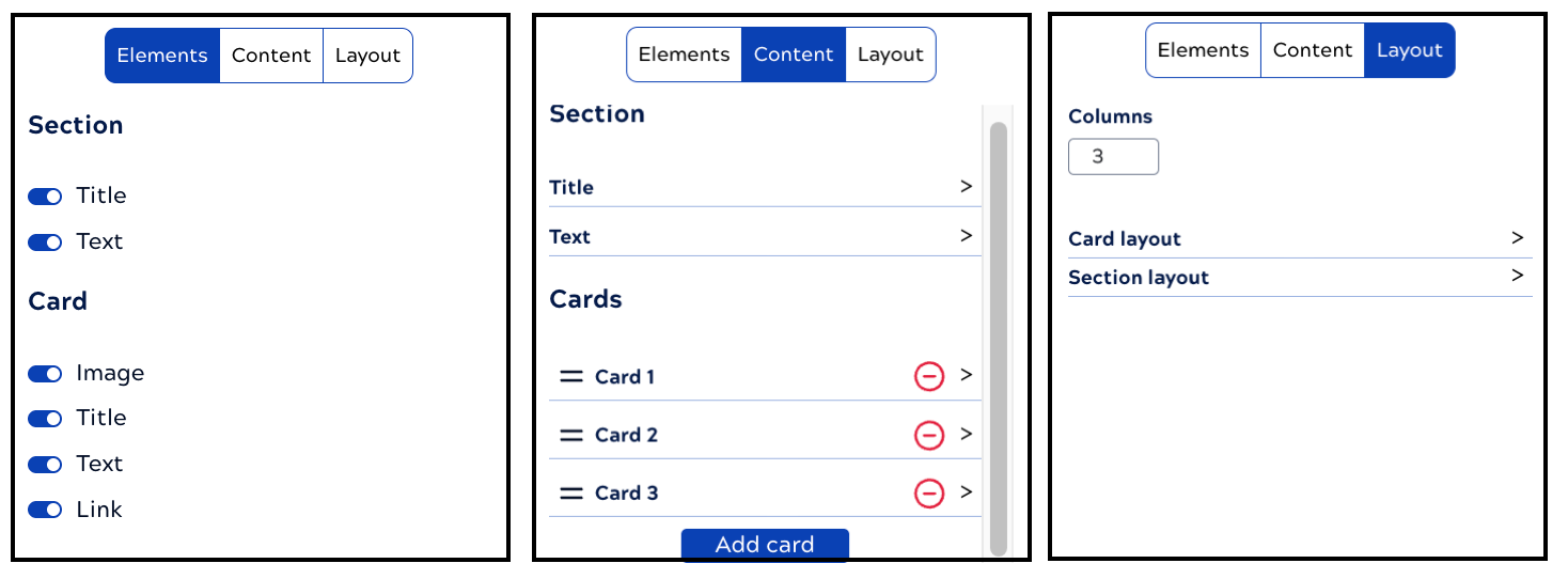
The card editor tabs provide controls to:
- Elements: Toggle section and card elements.
- Contents:
- Edit the section title or by-line.
- Edit the content that appears on each card, including the text, an image, or the link.
- Add or remove a card
- Layout:
- Set the number of columns
- Change the section layout, including:
- The space between cards
- Vertical padding
- Horizontal padding
- Change layout for all cards, including:
- Position the image above or below the title and text
- Set image relative size and alignment
- Set title and text size and alignment
- Show or hide the card background and select the color
- Set small, medium, or large space between elements
- Set the maximum width to small, medium, or large
- Show the link as a button or text and align the text link
- Enable or disable symmetrical card padding
Edit card contents
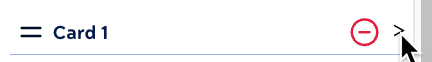
After hovering over the card section and clicking Edit Content, you can:
- Change the elements that display on cards:
- With the Elements tab selected, click to show or hide card elements.
- Change the image, text, and link:
- Click the Contents tab.
- Expand a card:
The content editor opens:
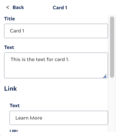
- Edit the title or text.
- Scroll to edit the link or image.
- Click back.
- Change card layout:
- Click the Layout tab.
- Expand Card layout.
- Set sizes, alignment, spacing, and link options as desired.
- Click back.
- When you are done editing, save the page.
The following describe how to work with: