


Navigate data previews
Data Preview is an integral component for pipeline design activities. After saving or validating a Pipeline, you can preview the data that a Snap passes down the pipeline. You can navigate through the data preview of Snaps via a table or JSON views, and generate data visualizations from that data.
- Set the number of records (optional)
- Launch data preview
You can change the number of records to be shown in the Data Preview, up to a total size of 15 MB. Depending on the size of individual records, increasing the number can provide better visualization.
To change the number of records:
-
In the IIP, click the dropdown next to your username to open the menu:

-
Select Application Settings to open the Settingsdialog:
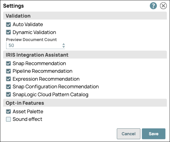
- In the Settings dialog, click the Preview Document Count drop-down menu, and choose from the available values.
- Click Save.
- Validate the pipeline
- Launch Data Preview
-
Use the outer arrows at the bottom left of the data preview to navigate to the
results for the next or the previous Snap:

-
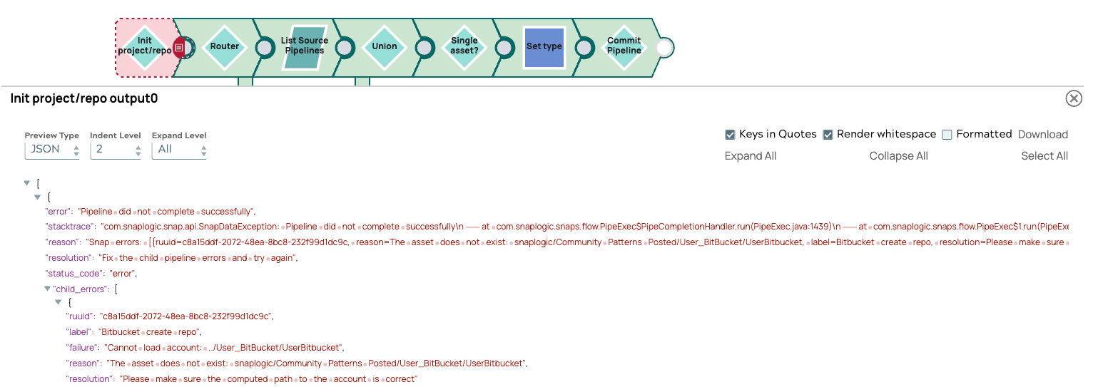
View data in error documents:
If a Snap fails to validate, you can preview data from the failed Snap's error documents.
Troubleshooting Data Preview
If you have issues with data preview, check the following:
- If the data preview does not display or you get a validation error, check the User Settings and select fewer records to preview. Make sure the records do not total more than 15 MB in size. If changing the number of records does not work, check with your administrator to see if Pipeline Validation has been disabled at the Org level.
- If the preview data is not exactly what you are expecting, the browser might
be caching stale data. In the toolbar, click Retry:
