


Designer Interface
SnapLogic Designer
Use the Designer to build pipelines by dragging Snaps to the canvas and configuring them. You can open Designer from the waffle menu on the right side of the header.
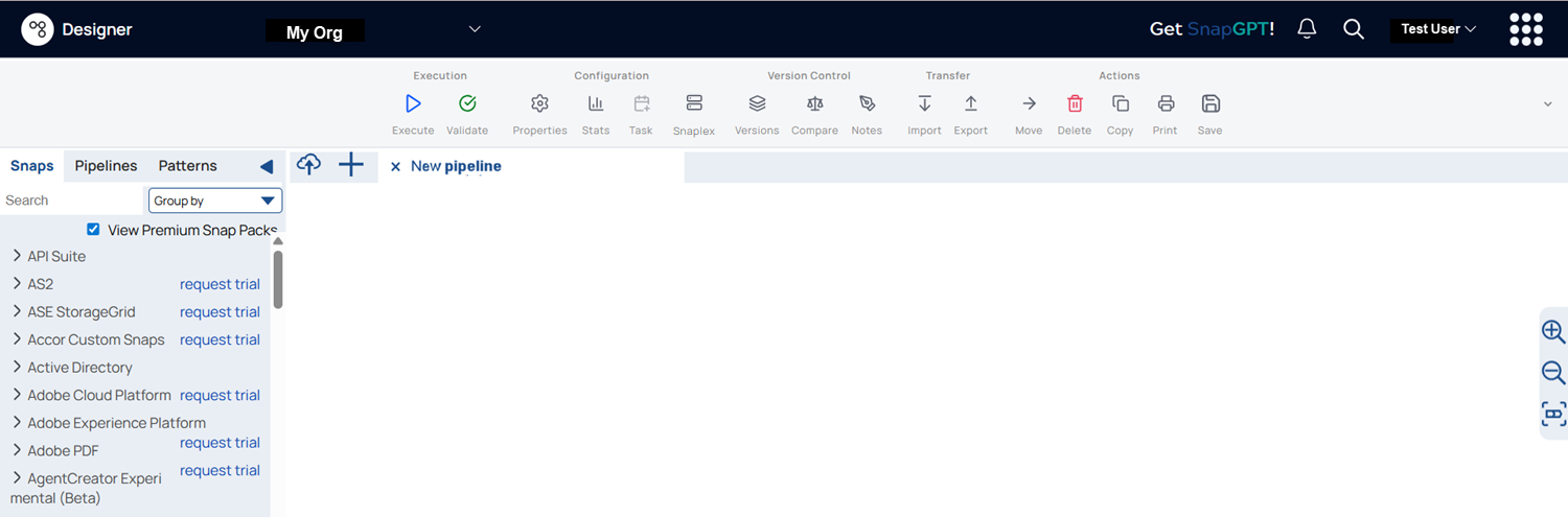
The following table describes the numbered elements in the Designer interface:
| Callout number | UI Element | Description |
|---|---|---|
| 1 | Asset palette |
The Asset palette contains three tabs: Snaps, Pipelines, and Patterns Catalog. Learn more. In the Snaps tab, you can group the Snaps either by Snap Pack or by Type. Learn more. In the Pipelines tab, you can view all the pipelines you have access to. Learn more. The Patterns tab displays the available SnapLogic Pattern Pipelines. Learn more. |
| 2 | Environment dropdown | Select the environment in which you want to execute your pipelines. |
| 3 | Designer toolbar | The Designer toolbar includes several controls to work with your pipelines. Learn more. |
| 4 | User profile | Configure your own global and app-specific settings. Learn more. |
| 5 | Designer Canvas |
The pipeline canvas, where you can drag Snaps to build pipelines. The canvas has a dotted grid background that subtly fades out as you zoom in or out. The pipeline canvas features a dot-grid background that provides the following benefits:
|
| 6 | Zoom to fit |
Zooms the pipeline to fit the canvas. |
| 7 | Zoom controls | Zoom in and zoom out on the pipeline. |
| 8 | Canvas footer |
The canvas footer includes the following elements:
|
Minimap: Shows a small preview of the full pipeline
with a draggable viewport indicator to navigate large pipelines quickly. It appears
only when the canvas is larger than the viewport, and while you scroll.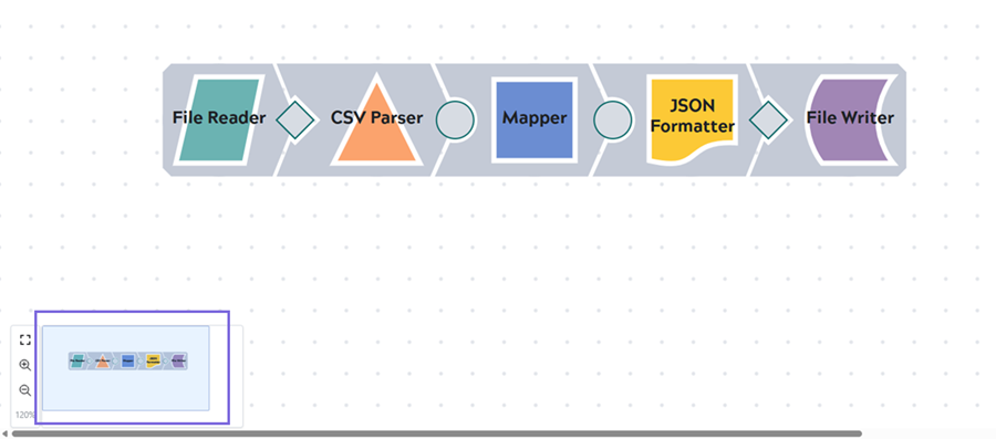 |
||