


Node usage
Displays node usage Vs Entitlement
The Node usage dashboard displays node usage relative to your subscribed entitlement. Navigate to Monitor > Insights and click Node usage tab to open the dashboard.
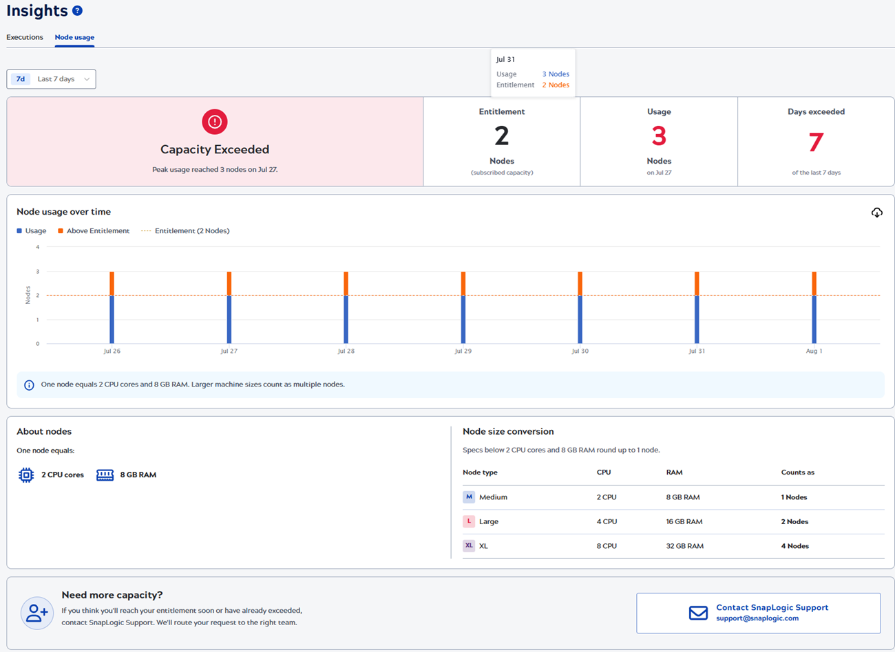
It provides insights on the node capacity status, and node usage over time.
Node capacity status
- Healthy: Peak utilization stayed at or below 90% of the entitlement, and no period exceeded it.
- Approaching Capacity: Peak utilization reached 91% to 100% of the entitlement.
- Capacity Warning: Peak utilization reached 101% to 120% of the entitlement, or one to four periods exceeded it.
- Capacity Exceeded: Peak utilization passed 120% of the entitlement, or five or more periods exceeded it.
Node usage over time
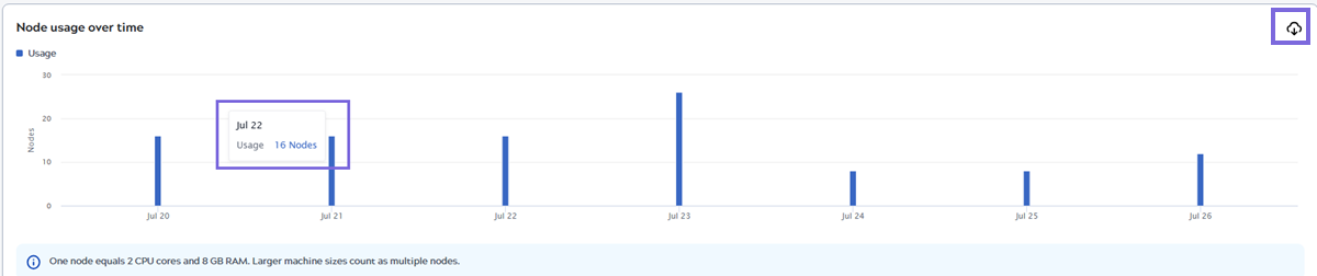
This chart shows node usage over the selected time range with the entitlement plotline. Click the Download icon to download graph data as a .csv file. Hover over a graph line to view the number of nodes in use and the entitled nodes for the specific time period.
Node size conversion
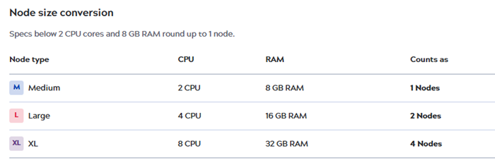
The node size conversion table displays the node type, CPU and RAM specifications, and its equivalent node type and count.
If you need more capacity, expect to reach your entitlement soon, or have already exceeded it, click Contact SnapLogic Support. SnapLogic routes your request to the right team.