


Metrics
The Metrics page displays usage graphs for a single Snaplex node, all execution nodes, or all FeedMaster nodes. The nodes emit metrics every 10 seconds. Metrics data is retained for 45 days. Graphs on the Metrics page show downsampled results, with the granularity depending on the selected time period.
How to view node metrics
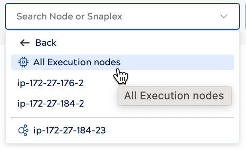
Click Metrics in the Monitor navigation menu and select a Snaplex node, or for a Snaplex with multiple execution or FeedMaster nodes, all execution nodes, or all FeedMaster nodes. The following example shows the dropdown menu for a Snaplex with multiple execution nodes:
Page controls
Use the page controls to:
- Select a time period from the dropdown menu. Available options include preset periods (Last 15 minutes through Last 1 week) or select a custom date range from the calendar (up to 45 days).
- Choose a specific Snaplex node or view all execution nodes or all FeedMaster nodes.
- Refresh the graphs.
- Add or remove specific metric charts.
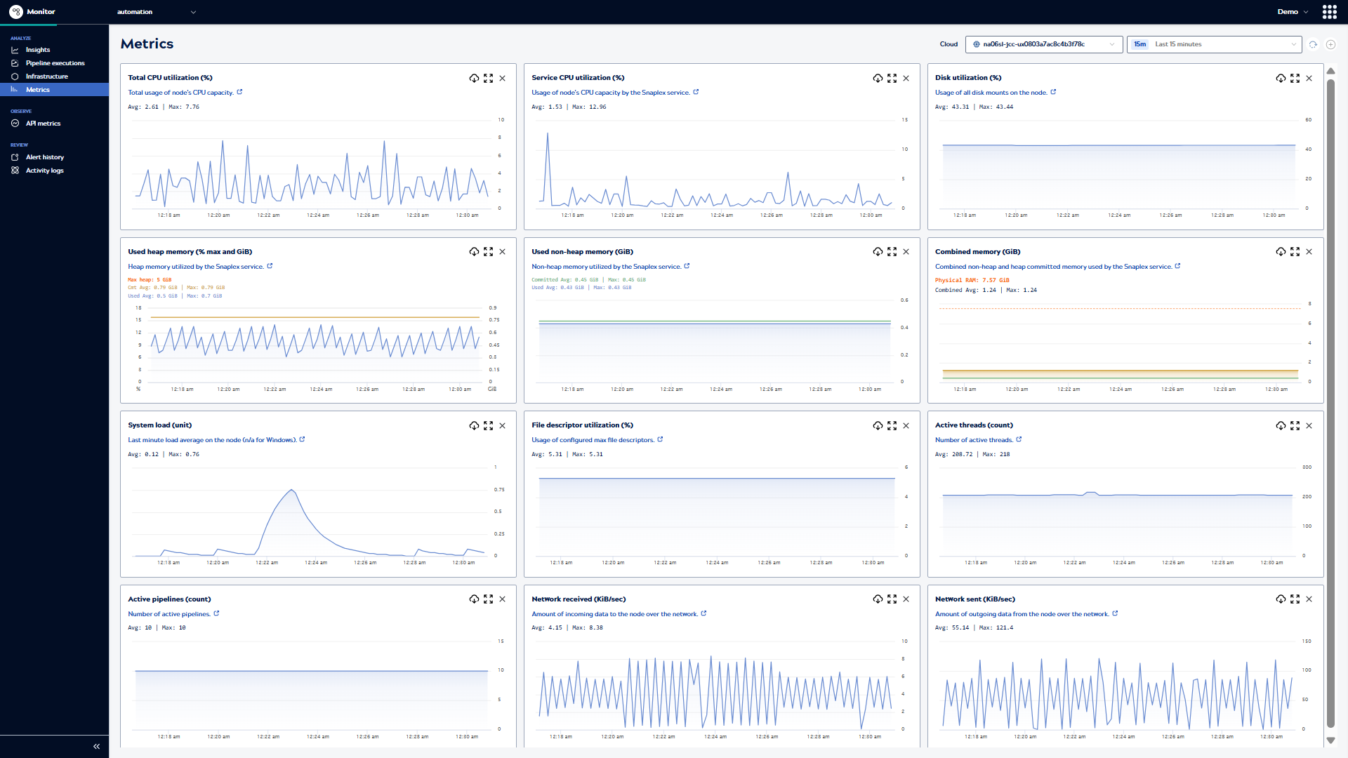
Use the graphs to:
- Analyze the behavior of a Snaplex node, all execution nodes, or all FeedMaster nodes.
- Improve task scheduling by finding under- and over-utilized time periods.
- Troubleshoot performance issues by identifying usage spikes.
- View trends and individual data points.
- Hover over a chart to see the specific timestamp and value at that point.
Note: Due to the downsampling algorithm selecting different representative points for each metric, hovering at the same screen position across multiple charts may show different timestamps. This is expected behavior and does not indicate a synchronization issue.
- Zoom in on charts to focus on a shorter time period.
- Expand a chart to determine which pipelines ran at a specific time and to view the execution details.
- Download data in .csv format.
Important: Downloaded CSV files contain the downsampled data shown in the charts, not the raw metric data.Important: Timestamps in the downloaded files represent Coordinated Universal Time (UTC), not local time.
How to interpret data
The Metrics page uses intelligent downsampling to display chart data efficiently while preserving important trends and peaks. The number of data points shown depends on the selected time period:
- 15 minutes: 90 data points
- 1-4 hours: 120 data points
- 12 hours to 2 days: 144 data points
- 1 week: 84 data points
- Longer periods: 135 data points
Most charts use the LTTB (Largest Triangle Three Buckets) downsampling algorithm, which selects representative data points that preserve the visual shape and key features of the time series, including peaks and valleys. Network received and Network sent charts use a different approach, averaging values over time intervals.
The downsampling algorithm preserves visually significant data points, including peaks and valleys, to maintain an accurate representation of resource usage patterns. When viewing metrics over longer time periods, the charts display fewer data points but retain critical spikes and trends. However, very brief spikes (lasting only a few seconds) between the displayed data points may not be visible in the chart.
The Average and Maximum values shown in the summary statistics are calculated from all raw metric data points, not just the downsampled chart points. For example, if a node reached 85% CPU usage briefly during the week, the Maximum value will reflect 85% even if that exact spike isn't visible as a distinct point in the week-long chart view. To investigate specific spikes in detail, narrow the time range to see more granular data.
Nodes emit metrics every 10 seconds, and this raw data is retained for 45 days.
If a node exceeds a performance threshold, it creates an alert that you can view in the Monitor Alert history page. You can also configure notifications to receive a Slack or email message when an alert occurs. The SnapLogic Platform sends one message each time the performance crosses above the threshold.
Technical details
The Metrics page downsamples data using the LTTB (Largest Triangle Three Buckets) algorithm for most charts. This algorithm works by:
- Dividing the time range into buckets
- Selecting data points that form the largest visual triangles between adjacent buckets
- Preserving the overall shape, trends, and significant peaks in the time series
Network received and Network sent charts use time-interval averaging instead of LTTB. Nodes emit metrics every 10 seconds, and this raw data is retained for 45 days.