


Understanding data downsampling in Monitor
Overview
Data downsampling is a method for reducing a large number of data points into a smaller set while maintaining the visual accuracy of charts. The SnapLogic Monitor uses the Largest Triangle Three Buckets (LTTB) algorithm for most charts to preserve important trends, peaks, and valleys.
Downsampling is necessary because nodes emit metrics every 10 seconds, generating thousands of data points over longer time periods. Displaying all raw data points would make charts difficult to read and slower to render. The challenge is selecting which points to display while maintaining an accurate representation of resource usage patterns.
How LTTB works
Largest Triangle Three Buckets (LTTB) is a downsampling algorithm that intelligently selects the most visually significant data points. For example, if you have 10,000 data points for CPU usage over a week but the chart displays 144 points, LTTB selects 144 points that best represent the full picture.
The algorithm works in three steps:
- Divide — Split all data points into the target number of buckets. For example, 10,000 points divided into 144 buckets creates groups of approximately 69 points each.
- Pick the most important point from each bucket — For each bucket, the algorithm forms a triangle between the previously selected point, each candidate point in the current bucket, and the average of the next bucket. The candidate that creates the largest triangle is selected because a larger triangle indicates greater visual significance (such as a peak, valley, or sharp change).
- Connect the selected points — The selected points are plotted on the chart to create the visual representation.
Why largest triangle matters
The triangle area measures how far a candidate data point deviates from a straight line between its neighbors. A large triangle indicates the data point represents a spike, dip, or sudden change. A small triangle indicates the point follows a predictable pattern. This approach naturally preserves dramatic changes while omitting flat, uneventful data points.
How LTTB selects the most important points
Consider three candidate points in a bucket, all sharing the same start point (previously selected point at 30% CPU) and the same end point (next bucket average at 32% CPU). The only difference is the middle point being evaluated:
| Line | Middle point (Current Bucket) | Triangle size | Result |
|---|---|---|---|
| Baseline | 31% (almost flat) | Essentially zero — no triangle formed | Reference line |
| Candidate A | 36% (small bump) | Small triangle — point is close to the baseline | Not selected — not visually important |
| Candidate B | 55% (significant spike) | Large triangle — point is far from the baseline | Selected — represents a real CPU spike |
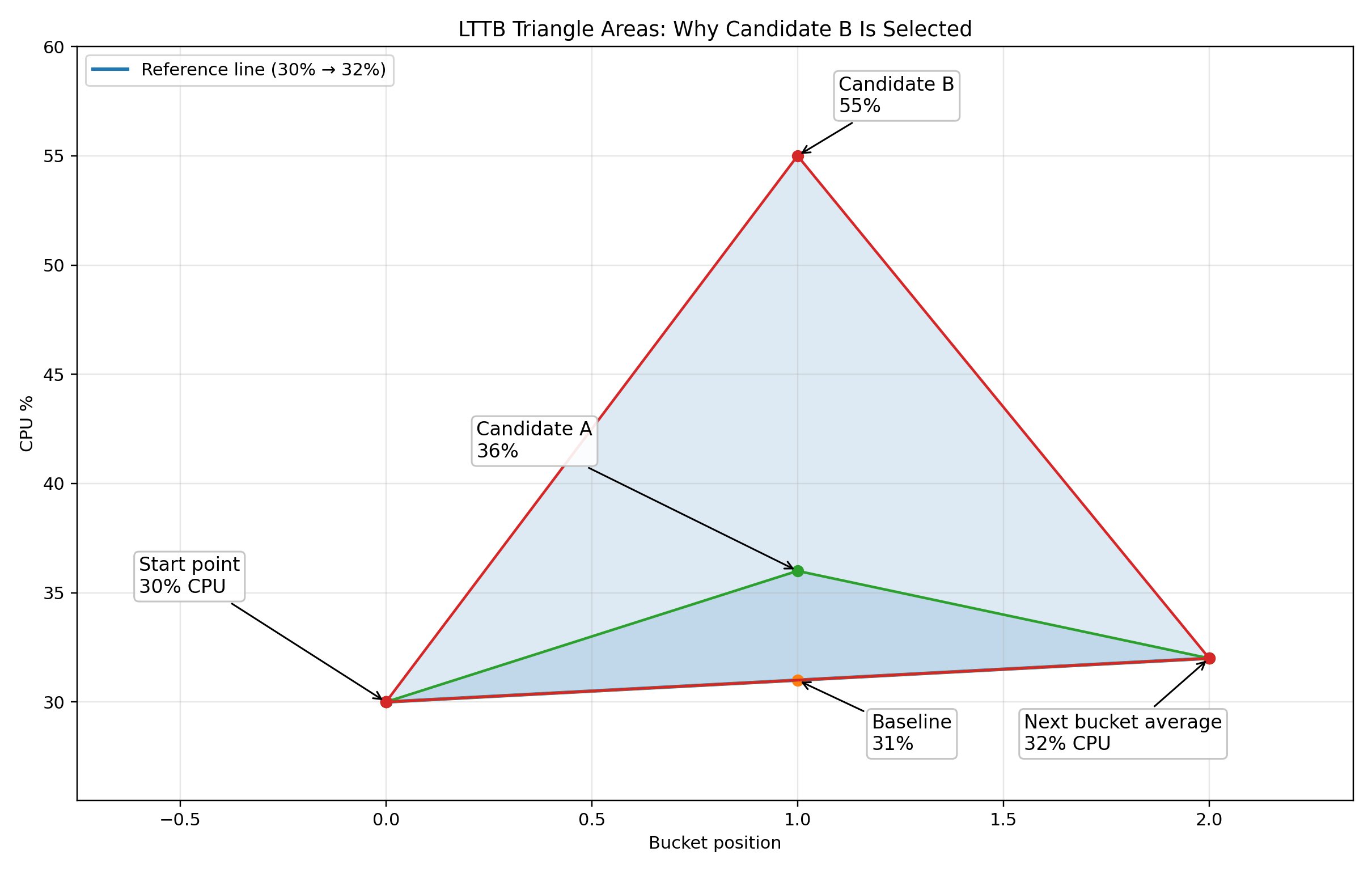
The key insight is that the triangle area measures visual significance. A CPU spike to 55% creates a much larger triangle than a flat reading of 31%, so the algorithm selects the spike. This ensures that important performance events remain visible on the chart.
LTTB compared to the previous averaging method
Monitor previously used time-interval averaging for downsampling. The following table compares the two approaches:
| Aspect | Previous approach (averaging) | Current approach (LTTB) |
|---|---|---|
| How points are reduced | Average all values in a time window into one number | Pick the most visually significant point from each bucket |
| Spikes (for example, CPU hitting 90%) | May be reduced through averaging with surrounding lesser values | Preserved — LTTB specifically keeps peaks and valleys |
| Chart appearance | Smoother but less accurate for brief spikes | Closely matches what the full-resolution chart would look like |
| Average and Maximum summary statistics | Previously calculated from downsampled data | Now calculated from raw data — ensuring accuracy |
Example: CPU spike detection
Consider a node that spiked to 85% CPU at 3:00 AM, then returned to 40% average usage. With the previous averaging method, viewing this over a week-long period might show a smoothed value around 45% at that timepoint, making the spike less obvious. With LTTB, the 85% spike is preserved as a distinct point on the chart, making performance issues immediately visible.
Additionally, the Maximum summary statistic displayed above the chart shows 85% because it is calculated from all raw metric data, not from the downsampled chart points. This ensures that even brief spikes are reflected in the summary statistics. To investigate specific spikes in detail, you can narrow the time range to see more granular data.
For technical details about the LTTB algorithm, refer to the academic paper: LTTB downsampling algorithm.